This post is a gentle introduction to the concept of representing your DNA matches as network graphs.
What is a Network Graph?
Graphs are often explained using Facebook as an example, as most of us are familiar with this social network. Here is a small network graph of my Facebook friends. I’m not in the graph myself. All the people are friends with me, and what I’m interested in is depicting how my friends are inter-connected.
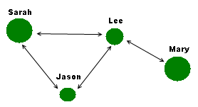
My friend Jason is friends with both Sarah and Lee, but doesn’t know my friend Mary (off to the right). Only Lee is connected to Mary. Lee is my friend with the most connections.
See how the connections are double-sided arrows? That’s how Facebook works. If you accept my friend request, then I am friends with you and you are friends with me, we call this a bidirectional graph. There are other networks which are one direction. Twitter is a good example: you may follow Celine Dion but she probably doesn’t follow you!
You may notice that some of the friends are shown as bigger circles than others. I’ve decided to rate my friends on how well I know them. That’s my own arbitrary rating on a number of 1 to 10. Why is this useful? Well, if my goal is to find acquaintances that might make good friends, I might think of reaching out to Lee before Jason on the basis that two of my close friends know him. Now we’ve got the start of a “recommender” system.
But my goal is to gain better insight into my genetic matches, so lets ditch the Facebook example and take a look at AncestryDNA or one of the other commercial DNA testing sites.
How does this work with DNA matches?
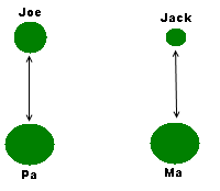
A network graph is a set of things that are connected. The DNA testing companies give you a list of matches that are connected because they share some DNA with you. By connection, I don’t mean genetically related. Let’s say Joe is your father’s brother, while Jack is first cousin to your mother. Joe and Jack are in your network graph because they share some DNA with you, but they do not share DNA with each other.
This depiction might seem at first glance to be two separate networks, but remember, I’m choosing not to include the tester. Otherwise the graph would look like this i.e. everybody is related to the kit owner.
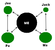
All those extra arrows just clutter the page and are not providing useful information. So my convention is to leave the tester out of the graph.
You may notice again that some circles are larger than others. My arbitrary rating here is the number of centimorgans you share with your match, hence why Ma and Pa are the largest.
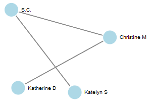
If uncle Joe and cousin Jack were at your sister’s wedding, then this graph isn’t providing you with much insight. Now lets say you’re trying to figure out where a new unknown match fits into your family tree. Looking at the Shared Match pages on Ancestry, you notice that Mary shows up on the shared match list of Ma and Jack, but not for Pa and Joe. Straight away, you can classify Mary as a maternal relative.

If you have tested either or both of your Ma and Pa, then Ancestry will provide this extra classification for you. But suppose you are like the many of us who are not in a position to do this? So Mary arrives into our network like this:
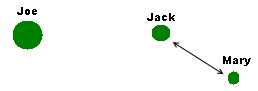
If you haven’t figured out your relationship with Joe and Jack, then you are none the wiser. However the likelihood is that scattered among your matches are a few that you can place in your family tree. You can get pretty far with a few.
Terminology
A quick note on terminology, in case you want to do some background reading on graph theory. The objects in a graph are called “nodes“. In our graph of matches, each match is a node. The connecting lines between them are called “edges“.
This is a gentle introduction to graph theory, and this is a more heavy-duty overview of graphs. Here is more detail on shared matches on AncestryDNA.
A Realistic Match Graph
So far we’ve looked at tiny graphs, so lets widen it out to look at a realistic Ancestry graph.
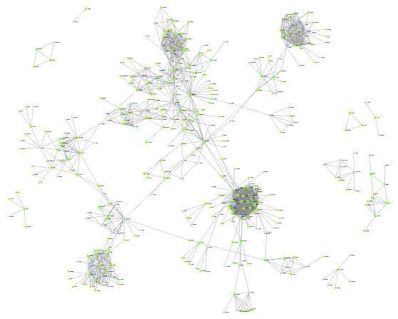
Don’t squint too hard at this picture, this is a zoomed-out first look at my shared match graph for matches at 20 cm or above. I’m not showing nodes that don’t have shared matches, otherwise there would be a lot of unconnected dots cluttering the page.
Now can you see the power of graphs? Straight away, I can see some clusters of highly interconnected matches. The “ball of wool” look comes from the higher amount of interconnections i.e. more lines. Dotted around the perimeter or nodes with one or to shared matches.
Shared Match Clusters
Let’s take a closer look at the most dense cluster.
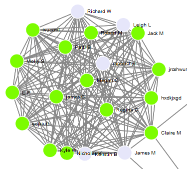
Why are some nodes green and some a light blue? Green means the match has a public tree. Better candidates for research! I know the names of some of the matches are hard to see, but zooming in brings up the detail. The goal at this high level is to decide where to focus your time for research.
Let Clusters Guide your Research
If I was picking between these two clusters, I’d probably start with the one on the left as the color guide tells me there are more nodes with trees.
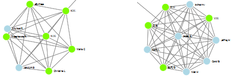
Take a look at this disappointing little pattern. Not a tree among the lot of them, I’ll look more closely elsewhere.
Usually I start researching the clusters that contain a match that I have already identified. For example, my highest match is my mother’s first cousin. Unlike all the other nodes, she gets to be a square. That’s purely so I can easily find her within a mass of matches. See how she herself isn’t as ultra-connected as the central node in the cluster to the left.
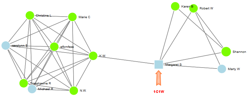
My cousin has also made her tree private, but that’s okay. I use the graph coloring to focus on the matches with public trees.
1 thought on “DNA Matches as Network Graphs – An Introduction”
Comments are closed.