In July 2017 I reviewed all my DNA matches on AncestryDNA by recording the shared CM number of every match. I repeated the exercise in February 2018 and again in early May 2018.
I was particularly interested in:
(1) the rate of growth of matches over this 10 month period of heavy marketing by the company
(2) the distribution of matches by shared CM for each given period e.g. my total number of matches below 10 CM, between 10 and 20 CM, and above 20 CM
(3) whether the distribution of matches stayed similar during this period of growth e.g. are the growing numbers solely due to tiny 6 CM matches
(4) what was the effect of the opt-out policy introduced in November 2017 e.g. did I lose a lot of matches who opted out
This blog post looks in detail at trends within my personal data.
(1) the rate of growth of matches over this 10 month period
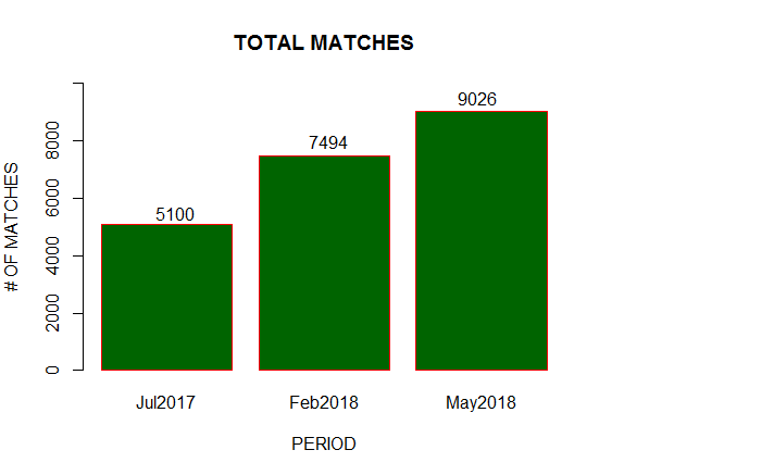
Before I break down the matches by centimorgan, here are the total number of matches at each snapshot in time: 5,100 in July 2017, 7,494 in Feb 2018 and 9,026 in May 2018

American or Irish readers may think my actual numbers are pretty small. My heritage is half Irish and half African, and so I have very few matches on one side. Those with two Irish parents and grandparents may have twice my totals, while U.S. readers may have much higher totals than mine.
But it’s the trend that is of particular interest: the total matches near doubled across a ten month period!
It would have been nice to have evenly distributed snapshots e.g. quarterly, but the results do show that the rate of growth accelerated in 2018. I assume that the reason is due to increased marketing spend resulting in more people testing. I’m not aware of changes in matching methods in 2018 which might have increased matches among the existing sample base.
Those of you who have been using Ancestry for a while will remember that once upon a time the display showed the total number of matches, but that has been removed. There is a way of calculating the number without any coding, which I documented in this blog post.
(2) the distribution of matches by shared CM for each given snapshot
So this growth is impressive at first glance, but may be fairly useless if just one of the extra 4,000 matches are 4th cousins or closer, and the rest are a lowly 6.0 CM match. I am particularly interested in the number of matches broken down by CM, which Ancestry does not provide via the website. I used techniques documented here to record the CM of all my matches to one decimal point. But knowing the number of matches at 6.9 CM versus 6.8 isn’t of particular use. Instead, I’m going to roll up the matches into four ranges:
- 6 CM to 6.9 CM
- 7 CM to 9.9 CM
- 10 CM to 19.9 CM
- 20 CM and over
This is also known as segmenting the data and I would more naturally refer to these ranges as segments, but I don’t want to confuse with the genetic terminology of segments.
Why these ranges? It allows me to separate “the wheat from the chaff” in terms of how confident I can be that
(a) the match is genuine instead of due to random factors of DNA inheritance and
(b) I have a reasonable chance of investigating the common ancestor (easier for 3rd cousins than for genuine 4th cousins).
20 CM and over represents approximately the relatedness of fourth cousin and closer, with a high. These are the “lowest hanging fruit” i.e. the matches I’m most likely to focus on first to try to establish the precise family tree relationship. I can also be confident that these are genuine matches and unlikely to include false positives due to the random nature of DNA inheritance and recombination.
Blaine Bettinger has a good article on the danger zones below 20 CM based on his own results, while this ISOGG article is based on wider academic research. The conclusion is that matches from 10 CM and upward have a 94% probability of being genuine.
My lowest range is set to every match that is less than 7 CM, which represents those matches of which we can be least sure are genuine DNA matches as opposed to coincidence. Ancestry doesn’t show matches below 6.0 CM anyway.
There is a grey area between 7 and 10 CM where the certainty of a match is above 50% but below 94%. Users with hundreds of fourth cousin matches may choose to ignore the 7-10 CM range. Those of us with less matches may pay more attention to this range while recognizing that a significant percentage will not be useful. Thefore I’ve defined an “upper-middle” range of 10-19.9 CM and a “lower-middle” range of 7-9.9 CM.
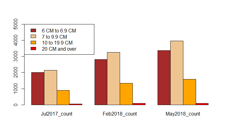
Here are the raw numbers:

And here are those numbers in a bar chart:

Clearly all ranges are trending upwards. My “20 CM and over” rose from 55 to 87 to 91. A few months later, though I haven’t done full analysis, I was delighted to tip over the 100 mark. My next zone of interest, “10 to 19.9 CM” rose from 893 to 1,331 to 1,585.
(3) whether the distribution of matches stayed similar during this period of growth
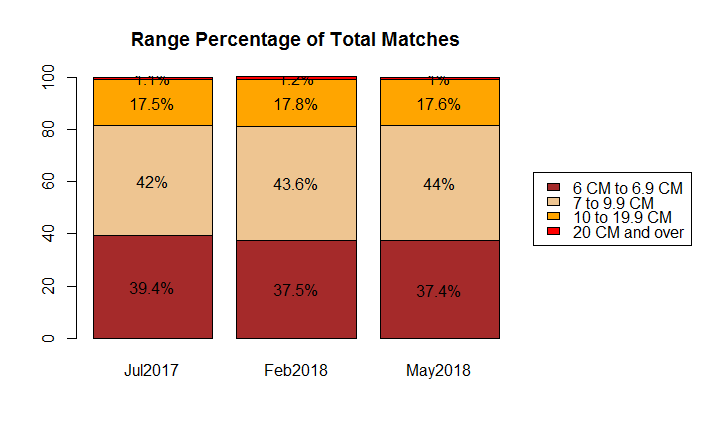
The next figure shows the breakdown by % of total matches. What is immediately clear is that the percentages remain similar through the growth period. That is no great surprise. One scenario I can think of where the close CM percentage might increase is if I (or a close cousin) encouraged a large number of family members to test in the same time period which could cause a spike at the higher CM level. But as distant relatives would be behaving similarly, it would even out over time.

The percentages for “20 CM and above” are a little hard to read in the graphic, because its proportionally small. They read: 1.1%, 1.2%, 1.0%.
(4) the effect of the opt-out policy introduced in November 2017
Finally, I want to address the impact of the introduction of the opt-out clause in November 2017. There were concerns at the time amongst the blogosphere that matches might drop off a cliff as people rushed to hide themselves. The short answer is that according to my results, there is no need to be concerned.
I have documented the results in a separate blog post as it may be of more general interest than the detailed numbers presented in this blog.
2 thoughts on “Ten Months of Growth on AncestryDNA”